EPCOR Case Study
Problem statement written by EPCOR:
Rather than calling 311 for drainage emergencies, EPCOR customers in Edmonton will now have a single point of contact phone number, effective Dec. 1, 2019.
The need to update web content to reflect this important change presents an opportunity to address issues and improve the user experience of EPCOR.com’s current navigation and site structure, specific to its ‘contact us’ information.
About the project
My agency was asked to perform a site audit, identify current paint points, and design a recommended
solution which my team of developers would program and implement. This
solution would be delivered to the client within a span of a few months. I was the lead designer, and I worked primarily with a senior UX strategist (who acted as PM), and one developer.
Process
- Employ design thinking methodology
Use empathy to try our best to understand the needs of different user groups
Conduct site audit of EPCOR’s contact pages and identifying primary opportunities for improvement
Conduct industry research, within and external to utility company space, and review their approaches to emergency contact information
Provide high-level recommendations on how to proceed, informed by our research.
Outcome
Handoff included a style guide, packaged code and maintenance guidelines.
User testing
User testing was used to identify pain points on EPCOR’s current solution for their contact information.
EPCOR provided us with users, who were mainly friends and family of current employees. Due to the testers living in other cities, accommodations had to be made to our previous plan.
Rather than book one-on-ones with all users, we set up screensharing permissions and did user testing over the phone.
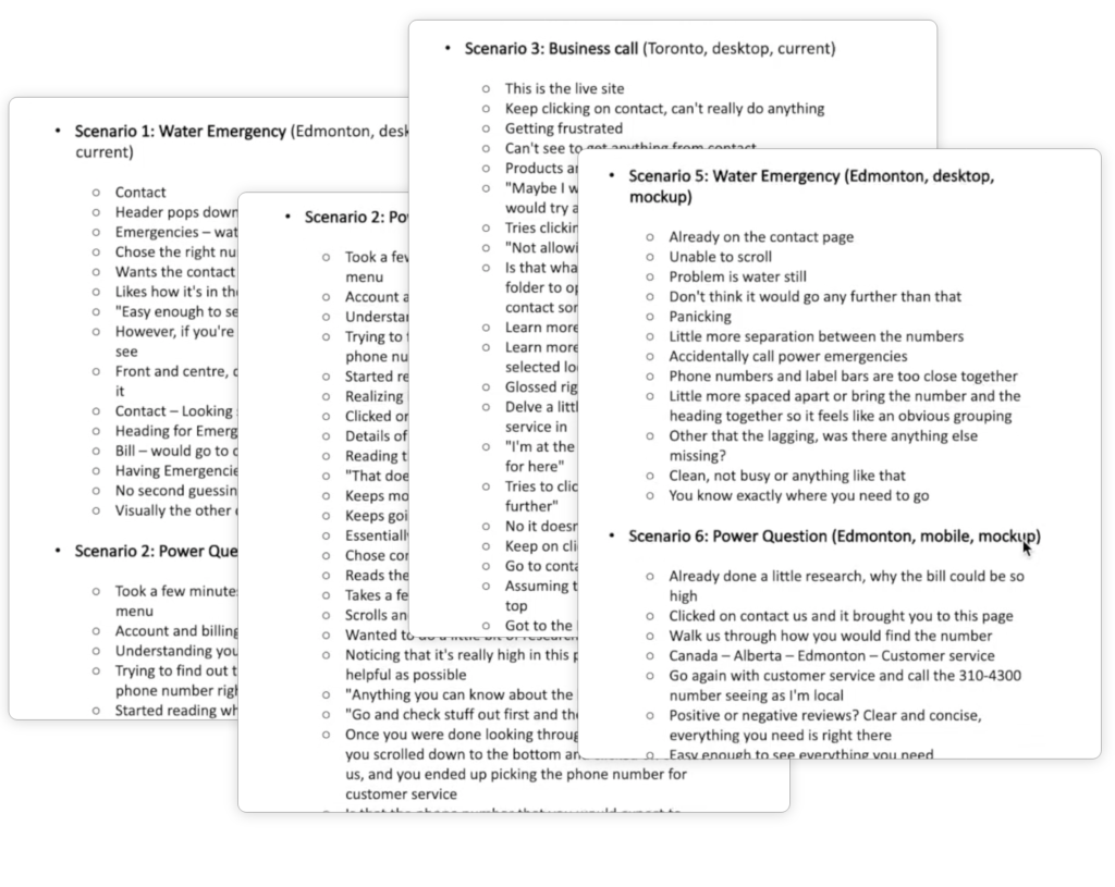
Observations
Based on our observations during user testing, we came up with three main problem areas:
- Issues presented due to EPCOR’s dependency on location services working accurately
- There are too many places where contact information resides, users have difficulty finding the ‘correct’ contact page.
- These issues are exacerbated when individuals were presented with the scenario that they were having an emergency (flood, sewage, power outage, etc.) and users felt stressed when they were unable to find emergency contact information right away.
Recommendations
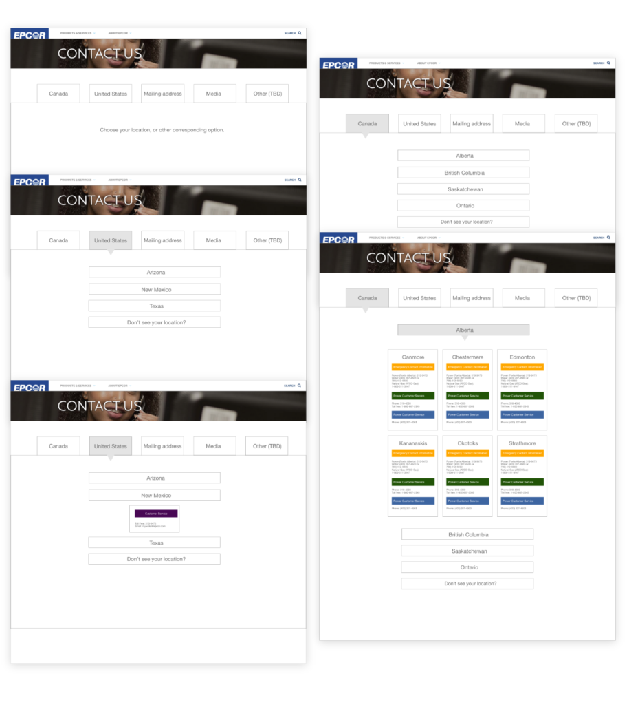
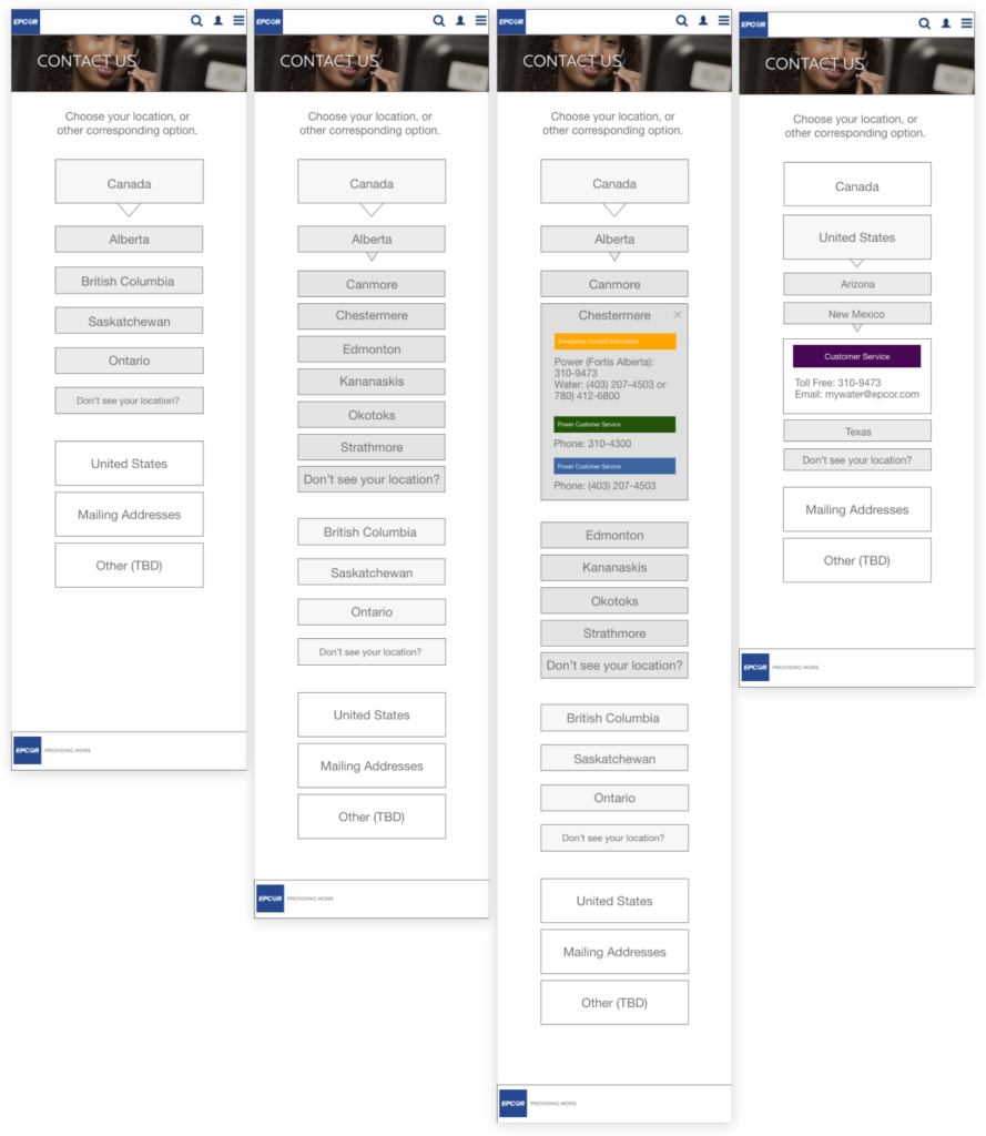
- Our recommendation for a first step was to move away from location-targeting for contact information, to ensure that users are able to find accurate information quickly.
- We recommended one singular, central contact page with a tabbed view of different locations/service areas.
- Rather than have a separate page for emergency contact information, we recommended including it in the new tabbed page, with a hierarchical view of who to contact in the event of an emergency using an accordion or drop-down system.
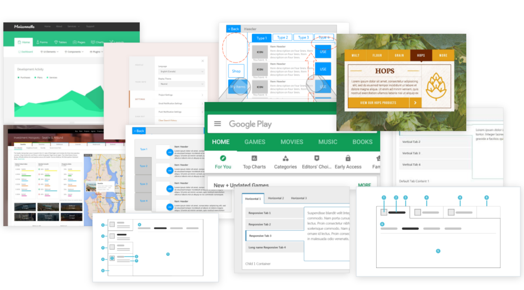
Design inspiration & idea generation
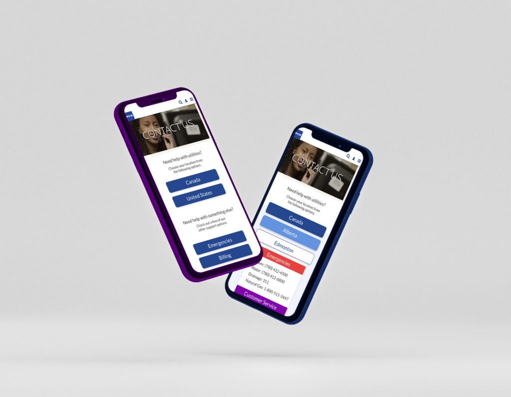
Initial mockups (desktop)
Initial mockups (mobile)
Style guide submitted to EPCOR
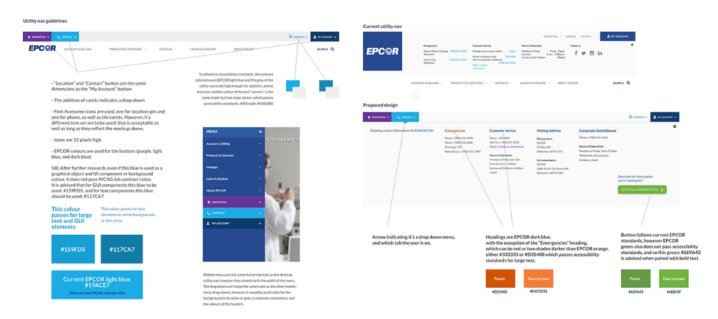
Final design